About this Course
This is a short Microsoft Excel course designed for someone who already has an intermediate/low-intermediate level of Excel to refresh and consolidate their knowledge by performing a case study of creating a graphical data dashboard. Starting from a spreadsheet containing data on the commercial activity of a company, the student will summarize the data in configurable tables in a guided way to end up building a summary data panel that allows the company's managers to have synthetic information of the activity that allows them to make decisions. Throughout the process, the use of tabular data, search, consolidation and summary functions and, finally, the use of dynamic tables and graphs that allow to present the information in an efficient way are covered. The course is an ideal tool for those who already know Excel and want to refresh and strengthen their knowledge of data management for use in daily work or to undertake more advanced courses.
What You'll Learn
- Working with tables in Excel
- Use text and date processing functions such as LEFT(), CONCATENATE(), YEAR() or MONTH() and data management functions such as VLOOKUP(), INDEX(), MATCH(), LARGE()
- Use data summary functions such as SUMIF(), SUMIFS(),COUNTIF(),COUNTIFS()
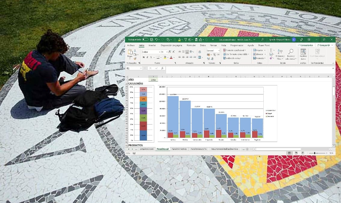
- Create data dashboards using tables and charts in an optimal way
- Create charts with multiple series and axes and pivot charts and pivot tables to summarize data
Prerequisites
- Low intermediate level of Excel
Instructors
Ignacio Despujol
Senior IT Analyst / Profesor de Ingeniería aeroportuaria