Online Courses Catalog
Explore thousands of online courses from MIT, Harvard, Princeton and more — free and paid, self-paced or instructor-led.
22,703 courses available
22,703 results — page 559 of 946
Data Visualization and Transformation with R
Duke University
Learn data science foundations by exploring, transforming, and visualizing data with R, gaining skills in exploratory data analysis and statistical thinking.

Fundamentals of Visualization with Tableau
University of California, Davis
Discover fundamentals of data visualization and use Tableau Public to import, analyze, and create effective data visualizations.

3D Data Visualization for Science Communication
University of Illinois Urbana-Champaign
An introduction to 3D scientific data visualization focusing on science communication and cinematic design to engage broad audiences. Develop skills to interpret and create visualizations.

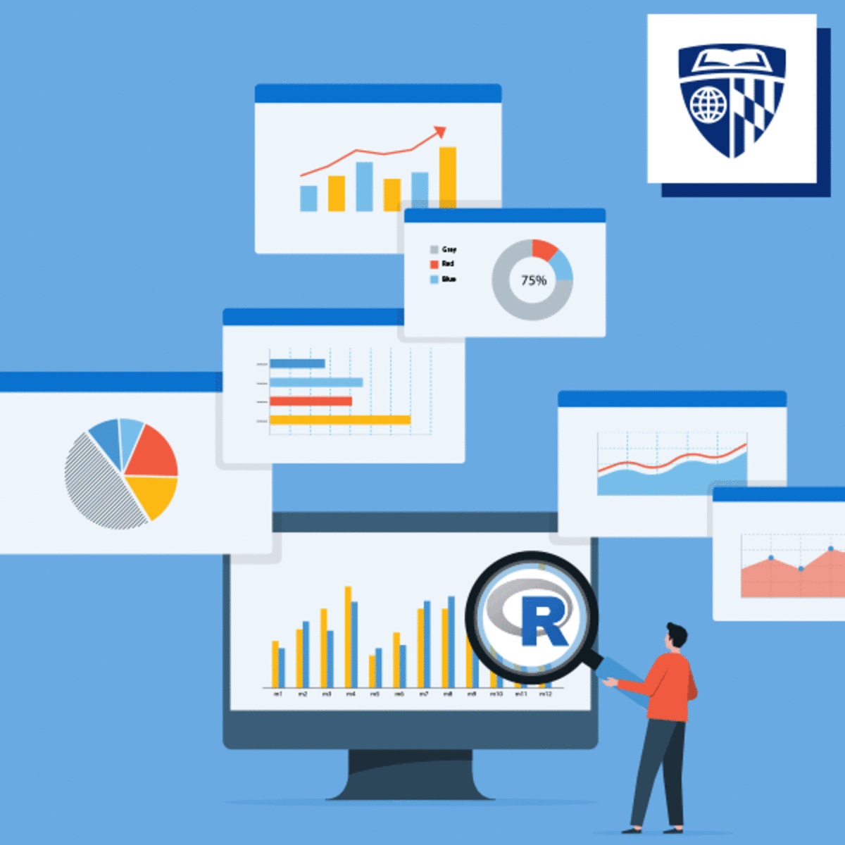
Data Visualization with R
IBM
Learn Grammar of Graphics to create various charts with ggplot2 in R, customize designs, and build interactive maps and dashboards.

Data Visualization with Python
Duke University
Learn to use Python, spreadsheets, and BI tools to create engaging data visualizations and effectively tell data-driven stories.

Data Visualization and Data Manipulation with Tableau
Università di Napoli Federico II
Enhance your Tableau skills to manage and analyze data from various sources by building relationships and advanced dynamic data manipulations.
Data Visualization Fundamentals in Python
University of Pittsburgh
Learn to transform data into compelling visual stories using Python libraries such as Matplotlib and Seaborn with effective design practices.

Data Visualization for Genome Biology
University of Toronto
This course introduces theoretical and practical aspects of data visualization in genome biology using online tools and R programming for all skill levels.

Data Science Project Capstone: Predicting Bicycle Rental
University of London
Practical course on predicting daily bicycle rentals using historical data, considering environmental and temporal factors to build an effective predictive model.

Data Visualization and Dashboards with Excel and Cognos
IBM
Learn to create data visualizations and dashboards using Excel and IBM Cognos without coding, to effectively tell data-driven stories.
Data Visualisation
Birla Institute of Technology & Science, Pilani
This course introduces exploratory data analysis and visualization techniques using various libraries to enhance visual communication and storytelling.
Data Visualization Capstone
Johns Hopkins University
Final course focusing on advanced data visualization skills using R and tidyverse to create figures, tables, and reproducible reports.

Data Visualization Best Practices
University of California, Irvine
This course covers the basics of data visualization within the data science workflow, emphasizing design principles for creating clear and effective results.
Data Visualization and Reporting with Generative AI
Microsoft
This course teaches creating impactful, interactive data visualizations using generative AI tools to simplify complex insights and support business objectives.

Data Validation in Excel for Beginners
Simplilearn
This Excel course offers a comprehensive journey into mastering data management, analysis, and visualization. Start by learning foundational skills like Goal Seek, creating drop-down lists, and applying data validation.
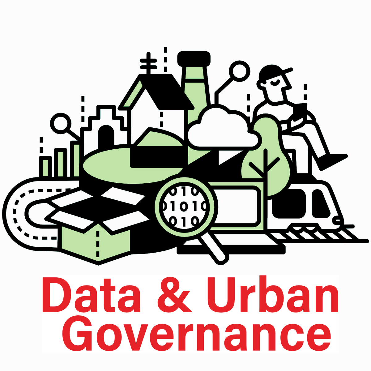
Data and Urban Governance
Sciences Po
Since the early 2000s, data influx has transformed urban governance, influencing policies, actors, and the structure of city life.
Data Understanding and Visualization
University of Colorado Boulder
Learn fundamental statistical concepts to analyze datasets and apply data visualization techniques using tools like Pandas and Matplotlib for effective communication.

Data Transformation in the Cloud
Google Cloud
Explore advanced principles of data transformation in the cloud and understand key tools and steps for data collection, processing, and storage.

From Data to Decisions: Making Predictions with AI
Vanderbilt University
Applied introduction to bivariate and multiple regression using AI to enhance prediction accuracy and streamline analysis.
From Data to Decisions: Finding Patterns with AI
Vanderbilt University
Learn to create univariate graphs such as histograms and box plots using AI tools to automate and streamline data analysis and identify statistical patterns.
Data to Advance Population Health: Global Perspectives
Johns Hopkins University
Learn methodologies to use data effectively for strengthening public health programs and policies, focusing on population-level data and applying a gender and equity lens.
Data Tidying and Importing with R
Duke University
Learn to import, clean, and organize messy data using Tidyverse tools in R for efficient analysis, visualization, and modeling preparation.
Data Science Decisions in Time: Using Causal Information
Johns Hopkins University
Advanced course for learners with basic statistics covering the use of causal data to support decision-making in business, medical, and technology fields.

Data Structures and Performance
University of California San Diego
Understand how Java programs manage large data sets using advanced data structures to improve efficiency and flexibility.